staycoldproject
A fashion e-commerce website.
Project Type
Team
Fashion / E-commerce
Freelance
Solo
My Role
Tools
Wireframing
Prototyping
UX Research
Figma
Usability Testing
Duration
Ongoing
The Company
Staycold Project is an independent streetwear brand founded in Lisbon, Portugal, in 2022. Designing graphic tees inspired by skate culture and hip-hop.
The Goal
Create a website design that improves user’s experience and attracts new users. The website is currently needing a redesign so that it reflects the brand identity better.
USER RESEARCH
To begin evaluating the project, I first organized all existing screens and user flows from the current app. This mapping was done in Figma to understand the full scope of interactions and identify which elements should be kept, improved, or removed. The process was carried out collaboratively between myself, the other designer, and members of the development team to determine which components were essential and which could be redesigned.
Competitive Analysis
I researched similar websites to understand which features they shared and what might be missing. Since there are many clothing and e‑commerce websites, I chose 3 similar ones to analyze.
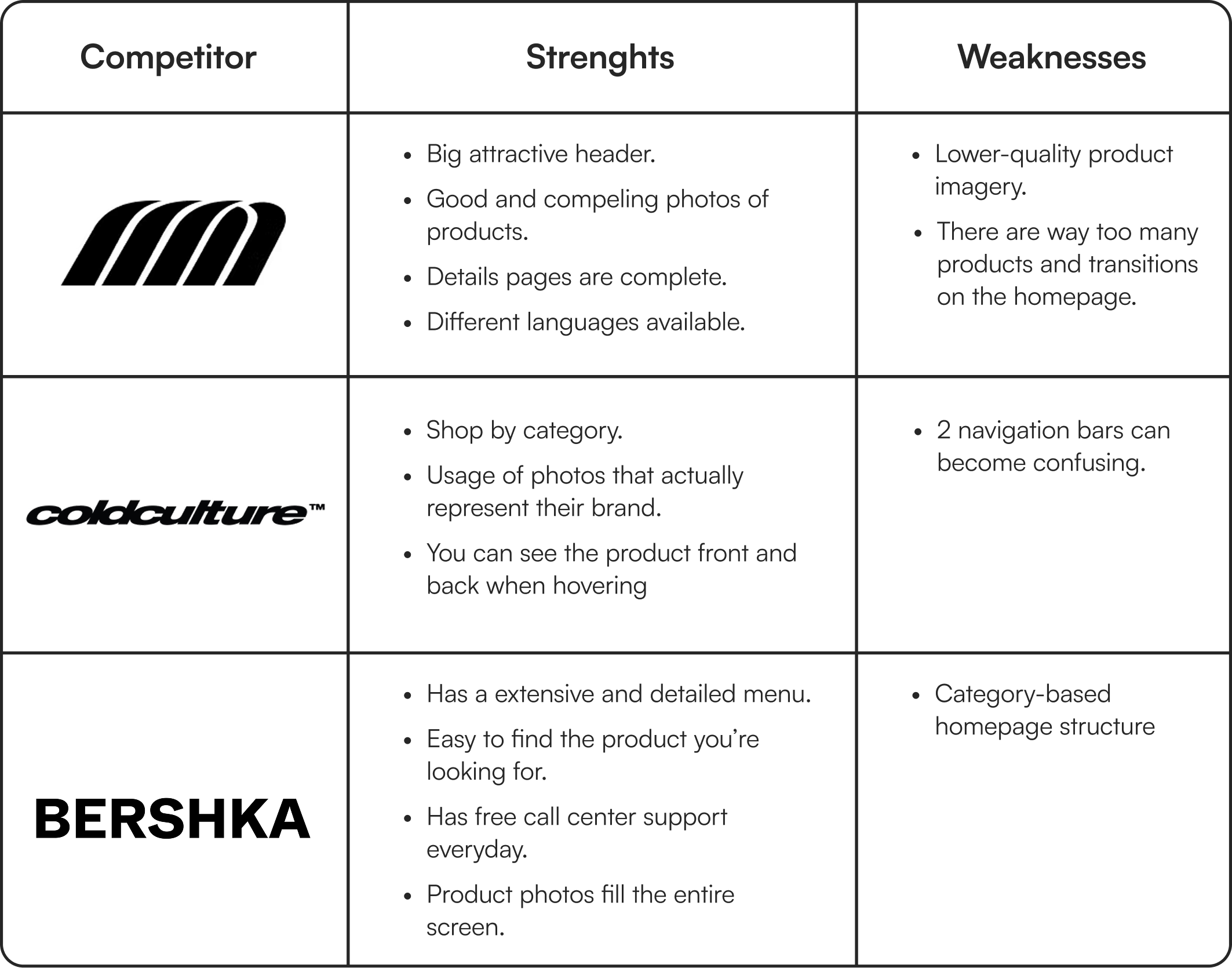
Findings
While large retailers prefer to use a more category-based structure, smaller retailers prefer to tell a story with their images and their art.
Across all competitors, being able to hover to preview the product you’re interested improves efficiency, allowing users to evaluate the items without opening multiple pages.
Excessive homepage content can increase cognitive load, making it harder for users to decide what to focus on and what is their next step.
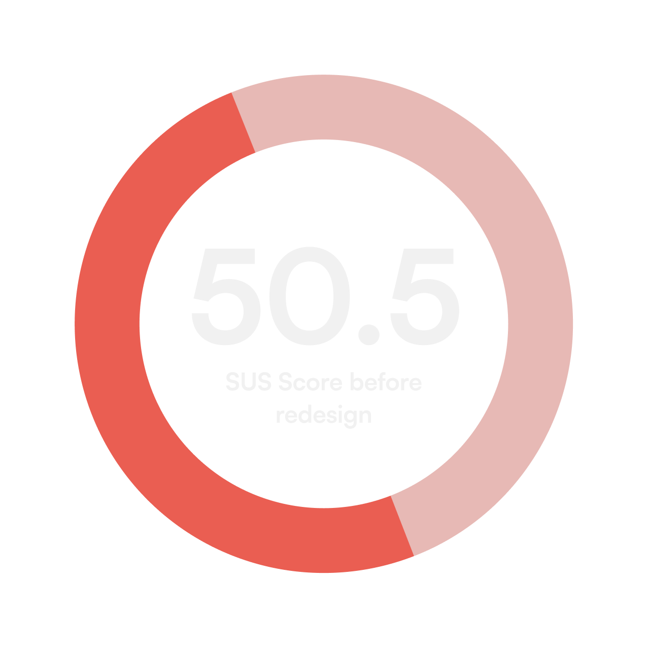
User Interviews + Surveys
5 users (ages 23-25), that never used this website, were interviewed to see how they felt about the website.
These interviews were done more specifically to understand possible frustrations, needs and motivations of new users.
OBJECTIVES:
Understand why people would pick this website.
Understand what features might be missing.
Find what frustrates user’s in this type of website.
Discover what user’s feel when seeing the website.
Findings
Across all interviews, users consistently raised the same concerns and identified the same pain points within the website. Their needs and frustrations aligned closely.
Affinity Diagram
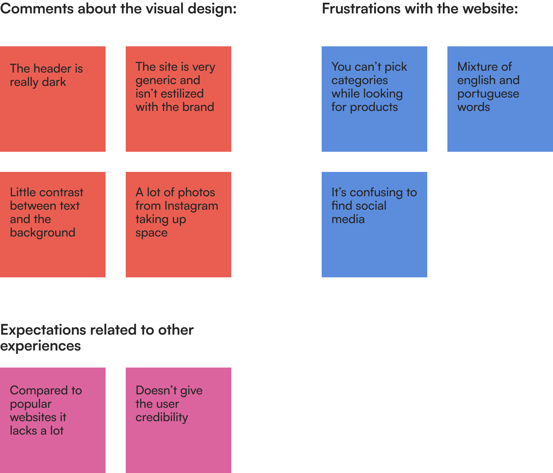
With the insights gathered from the interviews each topic was collected and put into sticky notes. Then I grouped each one. There were 3 themes across every user:
Insights
I discovered that all the users interviewed value the style of the website. They wish they could see something more stylized and personal to the brand, that way the website would be more credible.
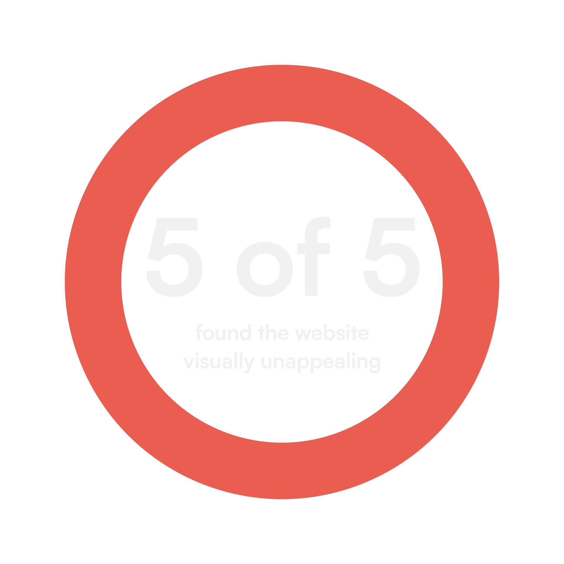
Almost all users pointed out missing elements, that would make their experiences better, like categories inside the product page.
Overall the website didn’t transpire credibility and there was a lack of elements that seem mandatory.
I discovered that all the users interviewed value the style of the website. They wish they could see something more stylized and personal to the brand, that way the website would be more credible.
Almost all users pointed out missing elements, that would make their experiences better, like categories inside the product page.
Overall the website didn’t transpire credibility and there was a lack of elements that seem mandatory.
“This website needs more branding, feels empty”
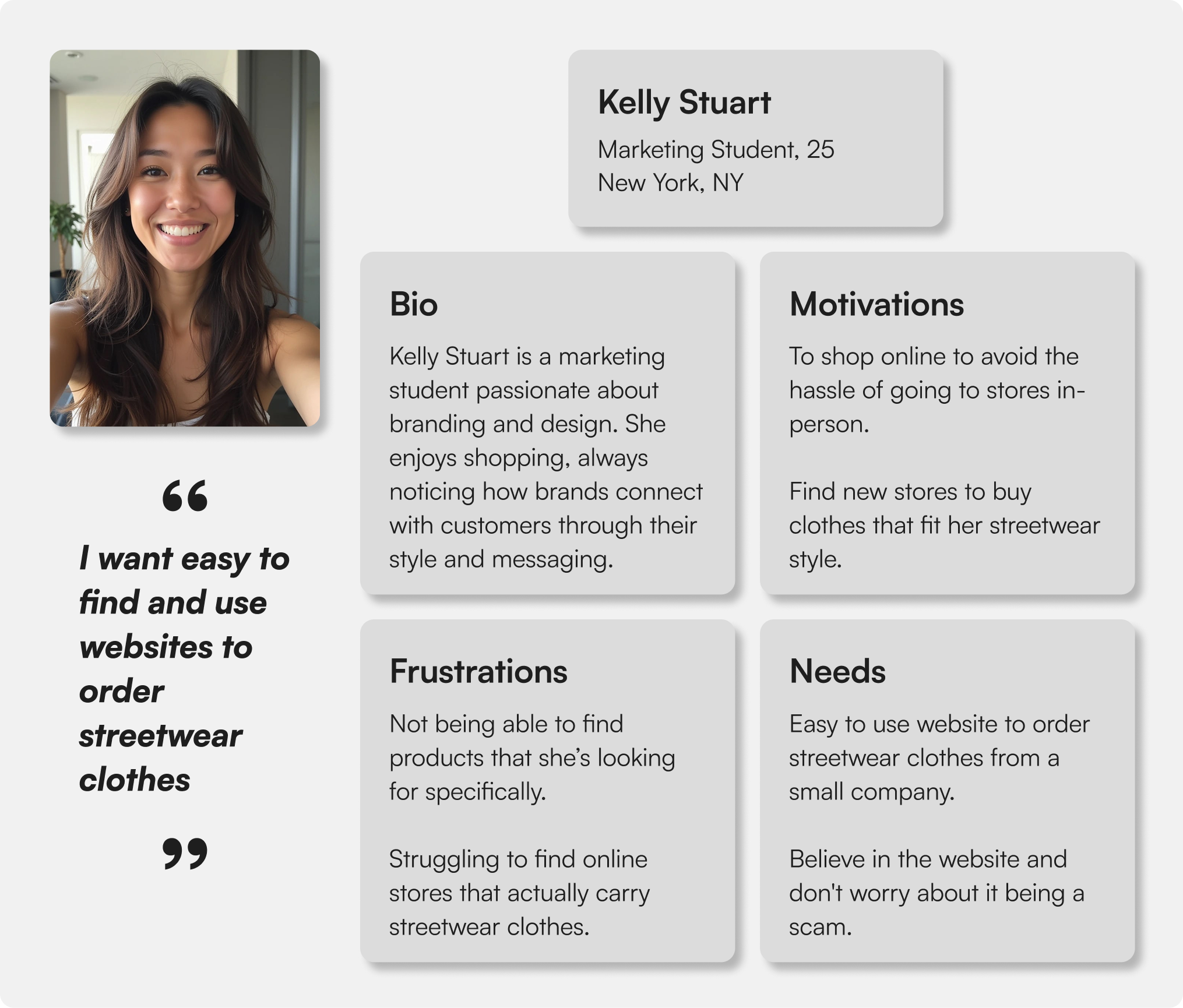
Persona
I created a persona to represent the target user, their motivations, frustrations and needs.
IDEATION & DESIGN
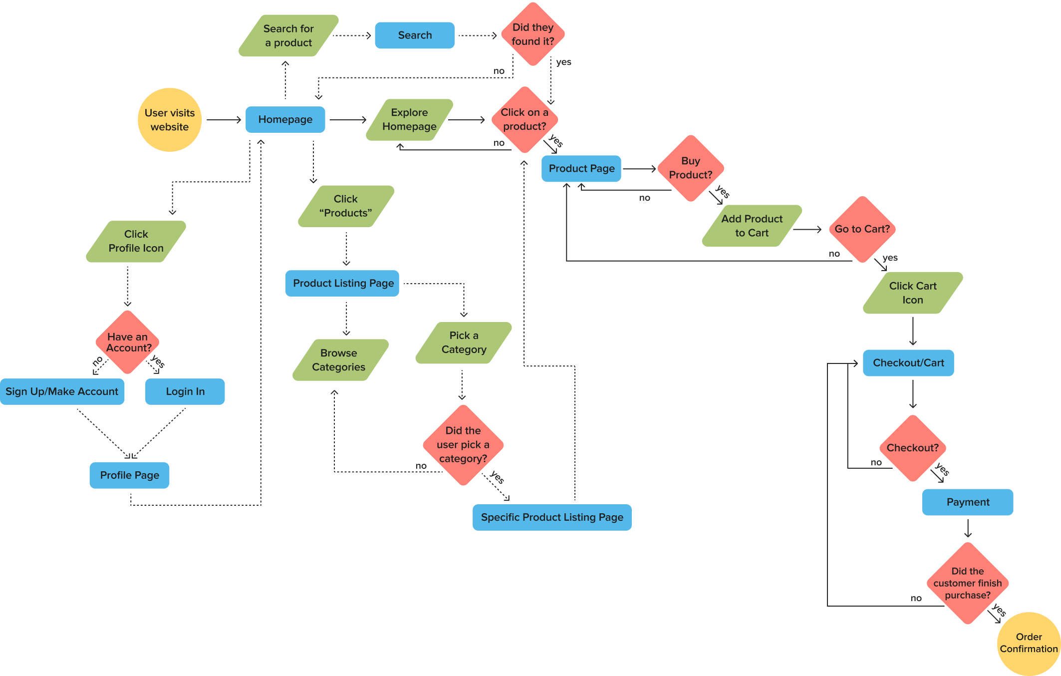
User Flow
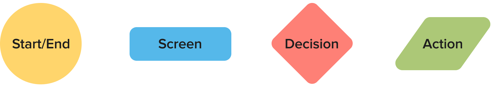
I began considering how users would navigate the website. A comprehensive user flow diagram was created for each action and how they connect. These flows cover all possible actions - browsing the homepage, locating a product, searching, clicking the profile icon, using the navigation bar, adding items to the cart, and checking out.
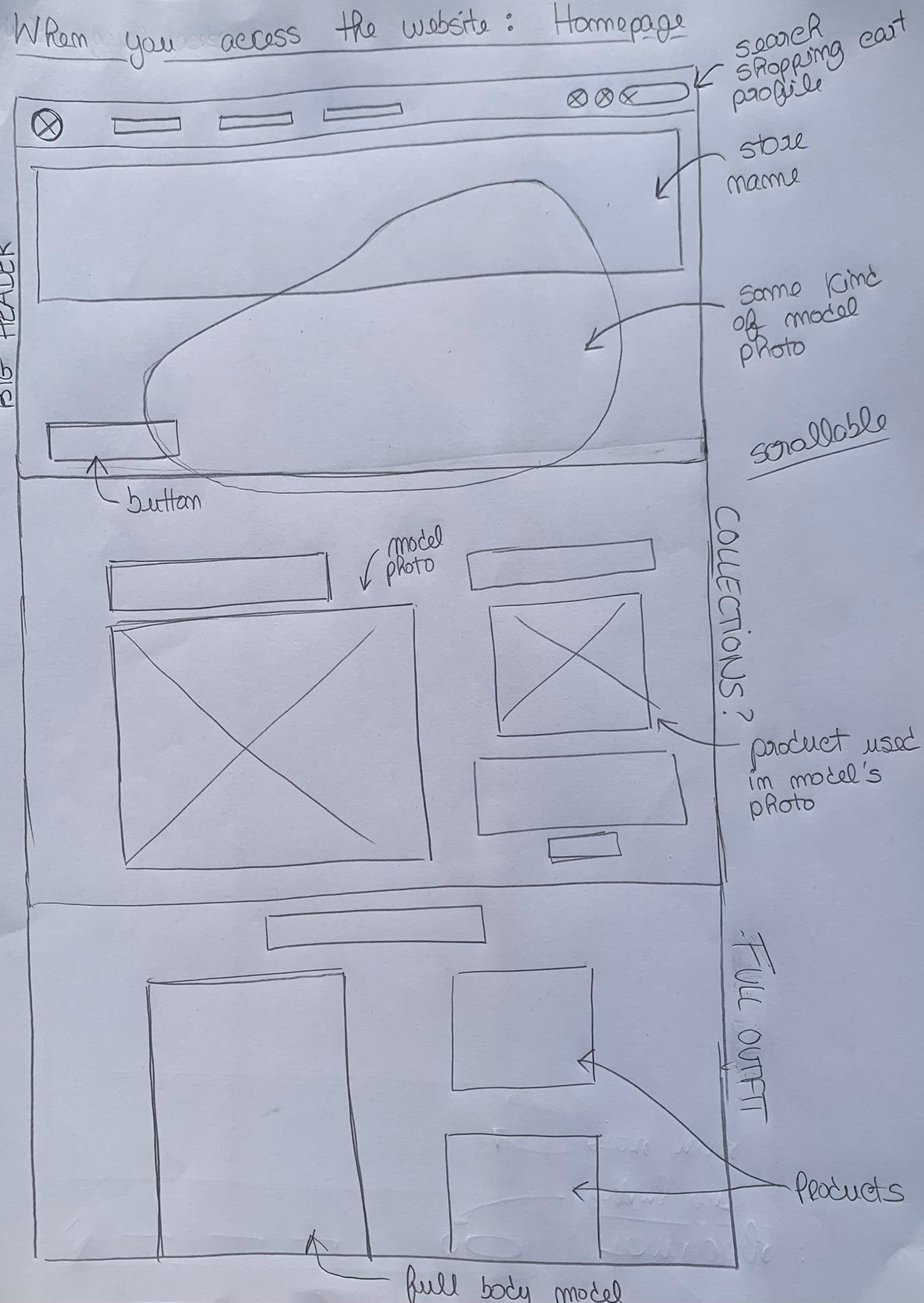
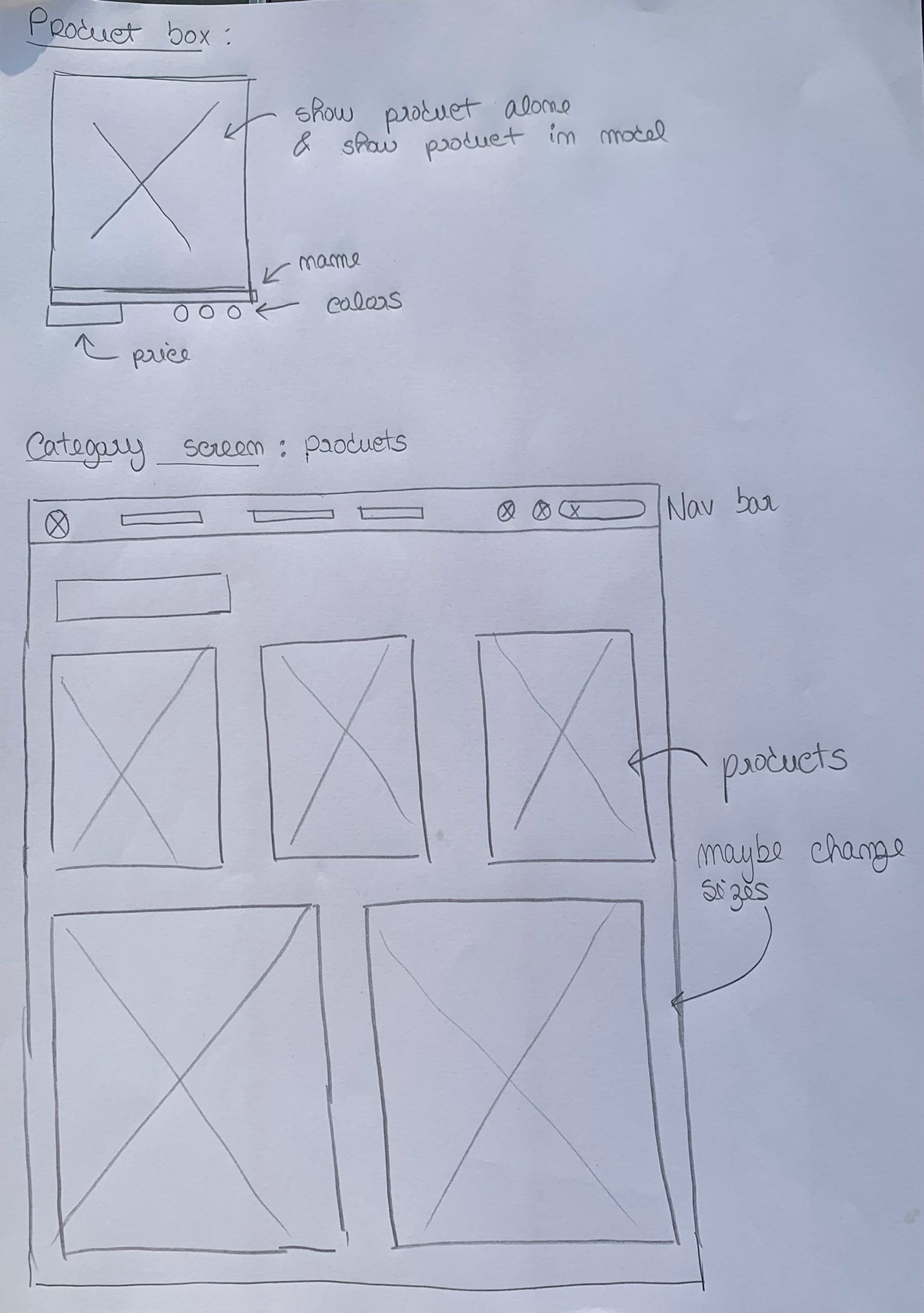
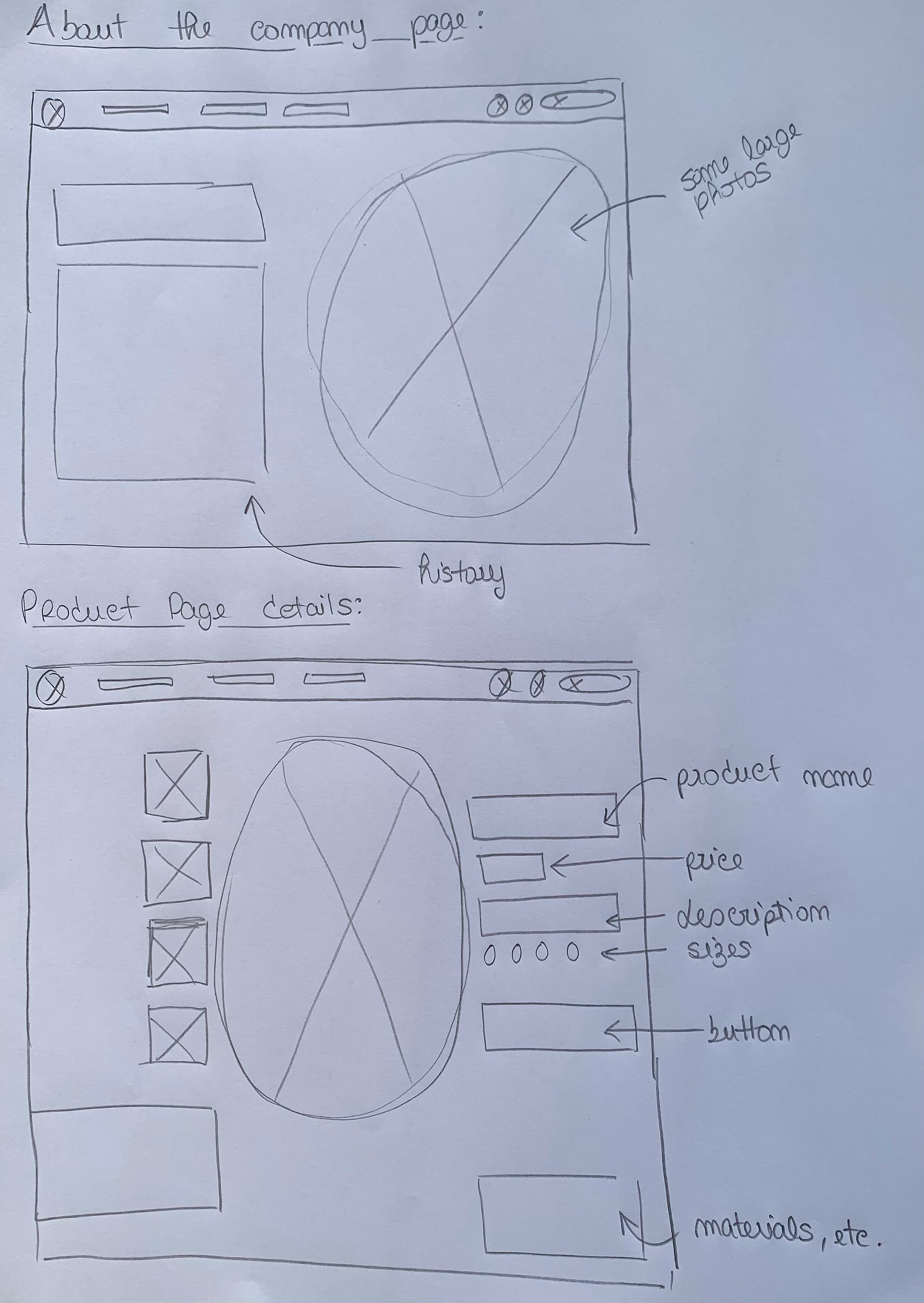
Low-Fidelity Wireframes
I explored different layout possibilities for the website and sketched initial concepts for the Homepage, Product Details page, About Us page, and the Catalog/Products page.
Mid-Fidelity Wireframes
After exploring different layout options and potential features, I selected the ones that best aligned with the concept I wanted to achieve. From there, I created simple wireframes for the main pages.
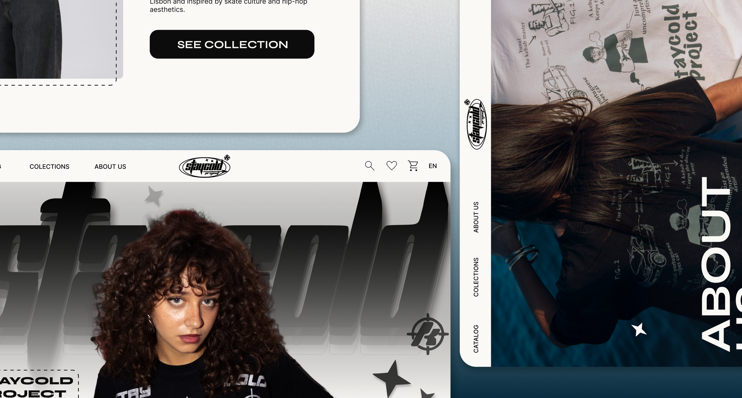
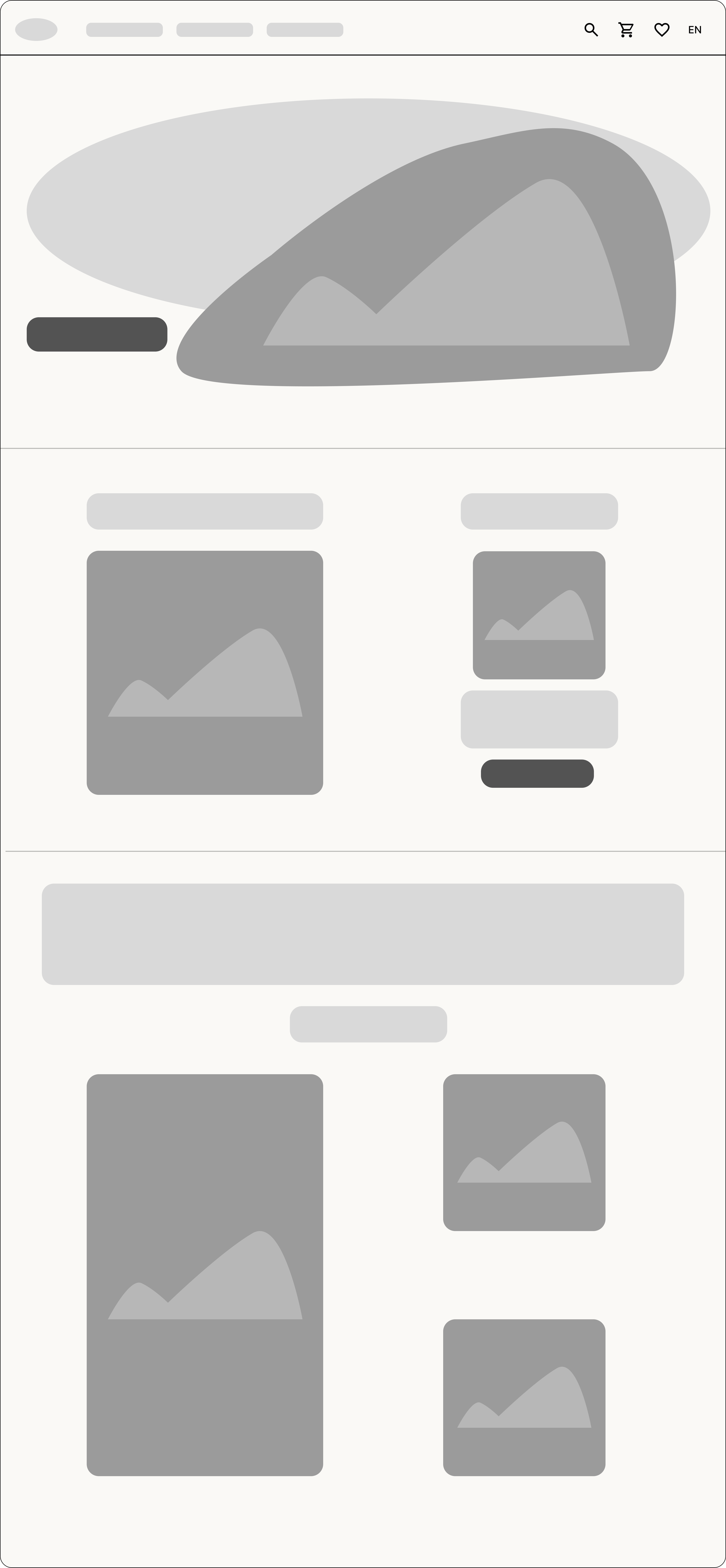
Homepage
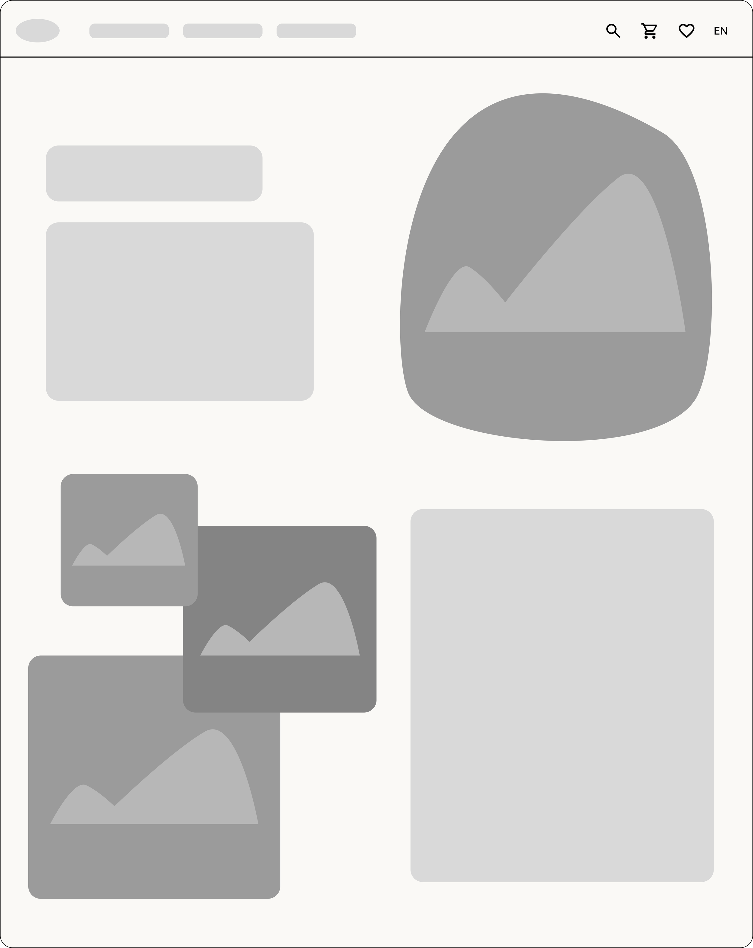
About Us
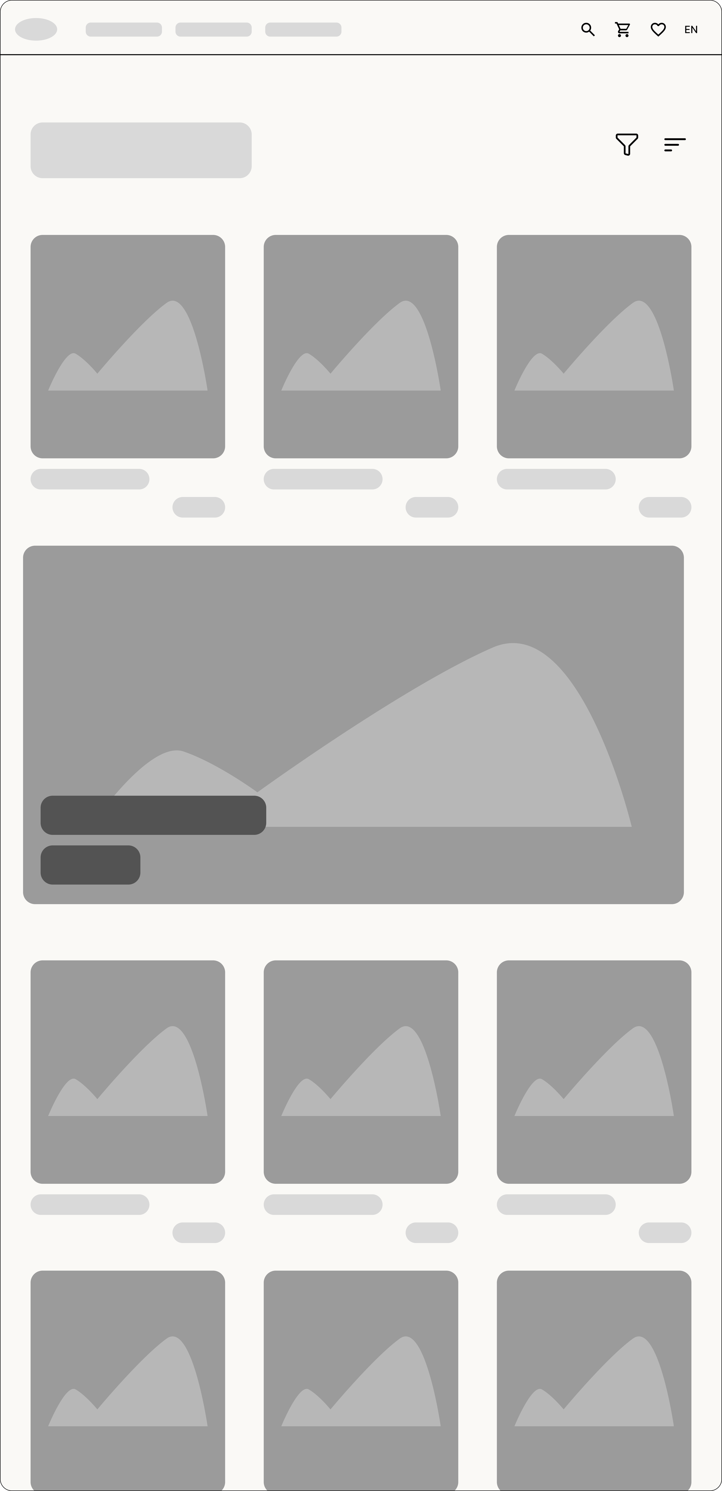
Catalog
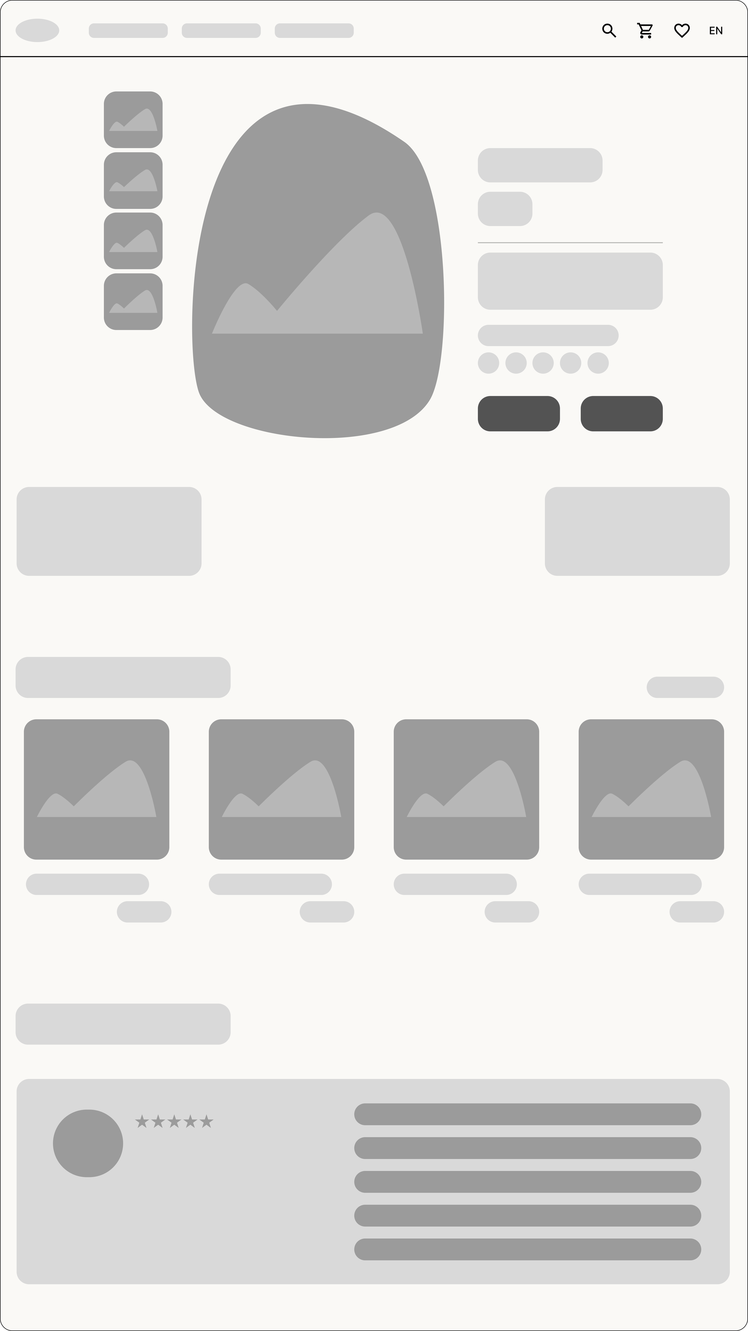
Product Details
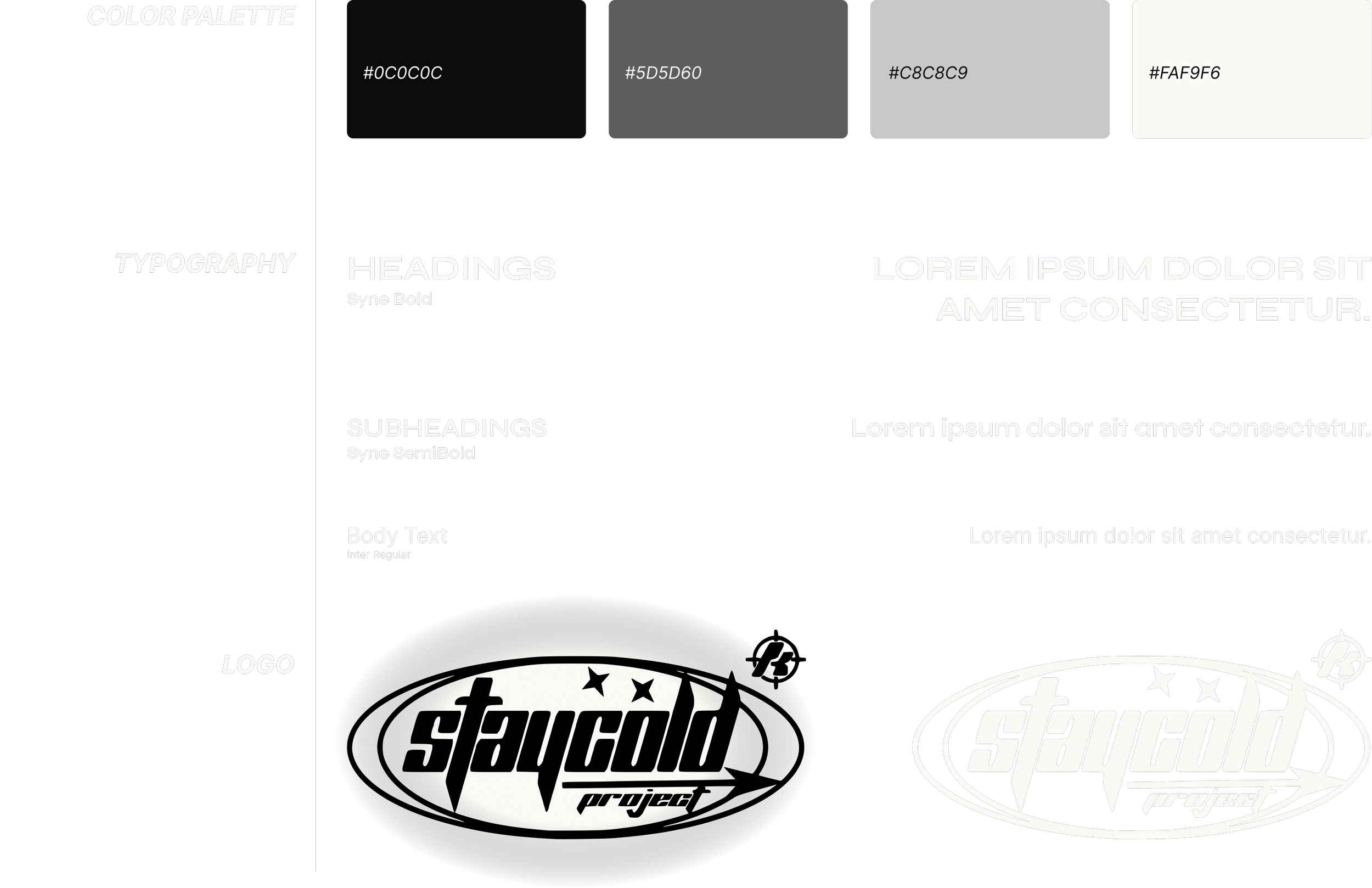
Branding
I selected branding that matched the style and attitude of the clothing. I was also inspired by the original logo, which is black and has a strong streetwear feel. The logo was created by the founder of the brand, the only adjustment I made was creating a white version of the logo, allowing it to work seamlessly in both light and dark modes.
This color scheme supports a clean, modern visual identity that reflects the brand’s aesthetic.