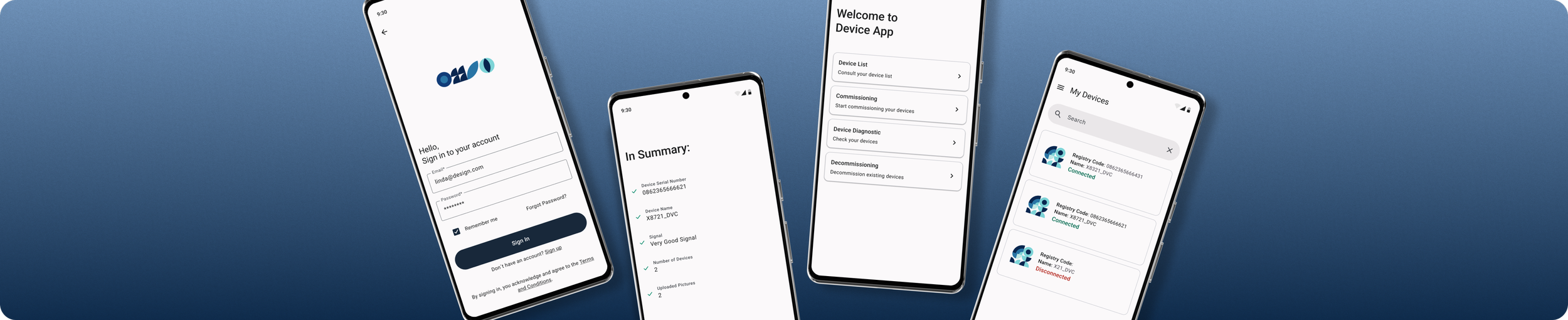
Pairing Device App
An app for pairing devices.
(Due to confidentiality reasons, the product name has been omitted. It is referred to here as the “Device Commissioning App”. The company’s name and specific elements have been also masked)
Project Type
Team
High-Fidelity UI Design
Me
My Role
Tools
Redefine Flows
Design Screens
UX Research
Figma
Duration
3 Months
The Problem
The app required a full redesign of its screens and user flows. Several existing elements were difficult for users to interact with, and the overall interface needed an update from Material Design 2 to Material Design 3.
The Goal
Make the app more accessible for all users and simplify key processes. This involved removing unnecessary steps to create a smoother experience and designing screens that were more visually pleasant and intuitive.
CONTEXT & PROBLEM DEFINITION
Understanding Existing Structure
To begin evaluating the project, I first organized all existing screens and user flows from the current app. This mapping was done in Figma to understand the full scope of interactions and identify which elements should be kept, improved, or removed. The process was carried out collaboratively between myself, the other designer, and members of the development team to determine which components were essential and which could be redesigned.

Findings
From this screen inventory, several key observations emerged:
Screens that required significant design updates.
User flows that needed clarification or complete removal.
Accessibility issues reported by real users, revealing underlying design problems.
User Flow Research
For the user-flow research, I began by analyzing existing apps with similar processes. I collected and organized their screens to gather inspiration and to clearly communicate the reasoning behind the solutions I aimed to propose. I also consulted UX/UI articles and books to better understand best practices and determine the most appropriate approach.
I started by selecting one specific flow and examining each interaction within the current screens. As I analyzed the flow, I documented potential user frustrations and identified what needed to be improved or redesigned according to the guidelines established by Material Design 3.
After consolidating all insights, I began designing new solutions that could be integrated into the updated flow, using the research and collected examples to support and justify each design decision.

Constraints
While the app was being updated and redesigned, several constraints emerged throughout the process. These included:
The requirement to use only components available in Material Design 3, meaning no creation of custom elements and keeping the interface as simple and consistent as possible.
Certain processes had to remain unchanged due to technical limitations and the way the app was originally built.
Although user feedback and data were available, there were not enough resources to conduct full usability testing.
Main Problems
After researching and analyzing the original app, I was able to identify the main issues within the user flow and evaluate them against UX heuristics. These findings were also discussed with the development team, who provided valuable insights based on real user feedback and the recurring problems users had been reporting. From this collaboration, I consolidated the key issues, which included:
The buttons in the top navigation bar were too small for the app’s target users, making them difficult to tap and interact with comfortably.
Users were required to interact with a device twice before performing an action, instead of being able to execute it directly. This added unnecessary friction and made the flow less efficient.
A button labeled “Next” appeared when editing an existing device, instead of “Save”. This created confusion about what action the user was performing and what would happen next.
The flow was unnecessarily split across 4 separate screens, making the process more complex than it needed to be.
Certain pop‑ups presented contradictory or confusing options. For example, after a successful commission, users were shown buttons like “Try Again” or “Cancel”, which made little sense in a success scenario and introduced unnecessary doubt.
Being aware of these problems made the design and redesign process much smoother, allowing for clearer decision‑making and more efficient execution.
Defined Objectives
After consolidating all the information gathered from reviewing the full app flow, the main issues were clearly defined, aligned across teams, and initial solution paths began to take shape.
Objectives:
Migrate all components from Material Design 2 to Material Design 3.
Explore improved UX solutions for key user flows.
Redesign all existing screens.
Once the redesign was complete, create new screens and new flows as needed.
DESIGN EXPLORATIONS
Mid-Fidelity Wireframes
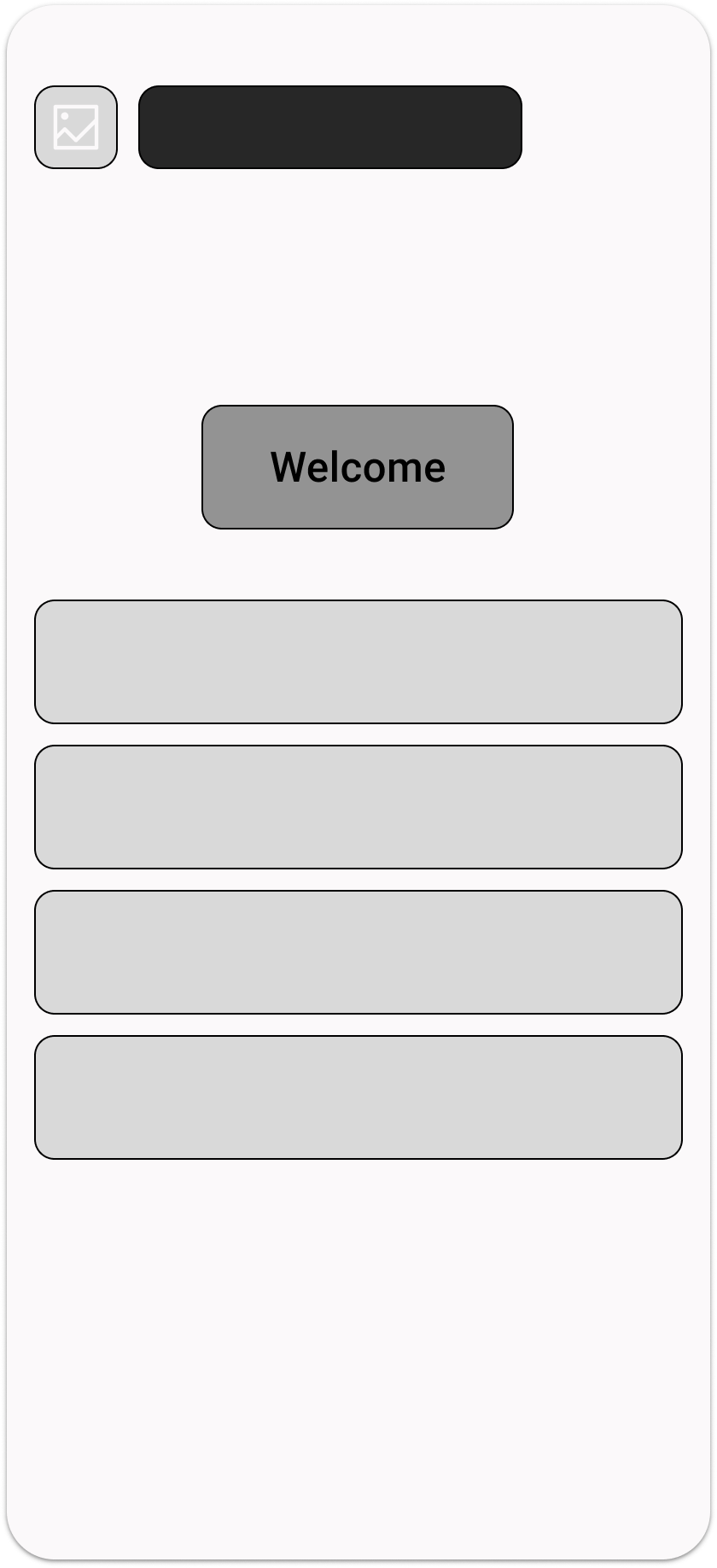
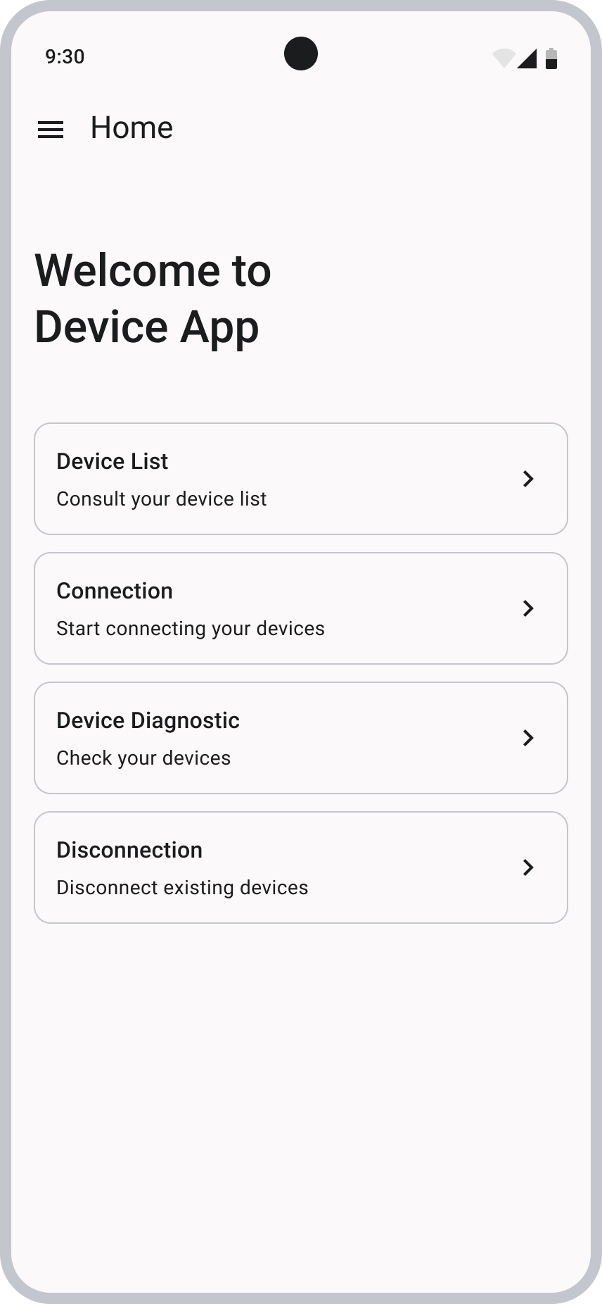
Most of the app was redesigned based on the original screens, but I also created new screens to improve key flows. One of the first additions was a Homepage. The previous version of the app didn’t include one, users were taken directly to a device list, with no structure or choice. Introducing a Homepage created a more organized entry point and gave users the autonomy to decide what action they wanted to take, resulting in a more intuitive and guided experience.
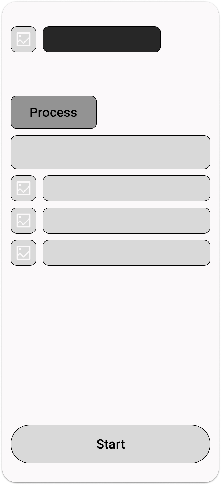
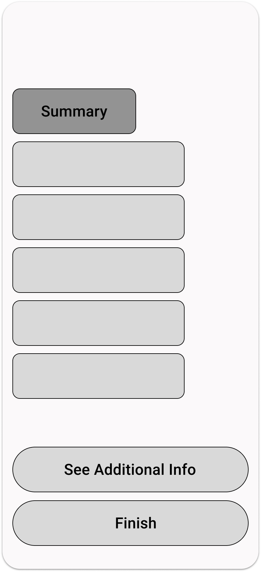
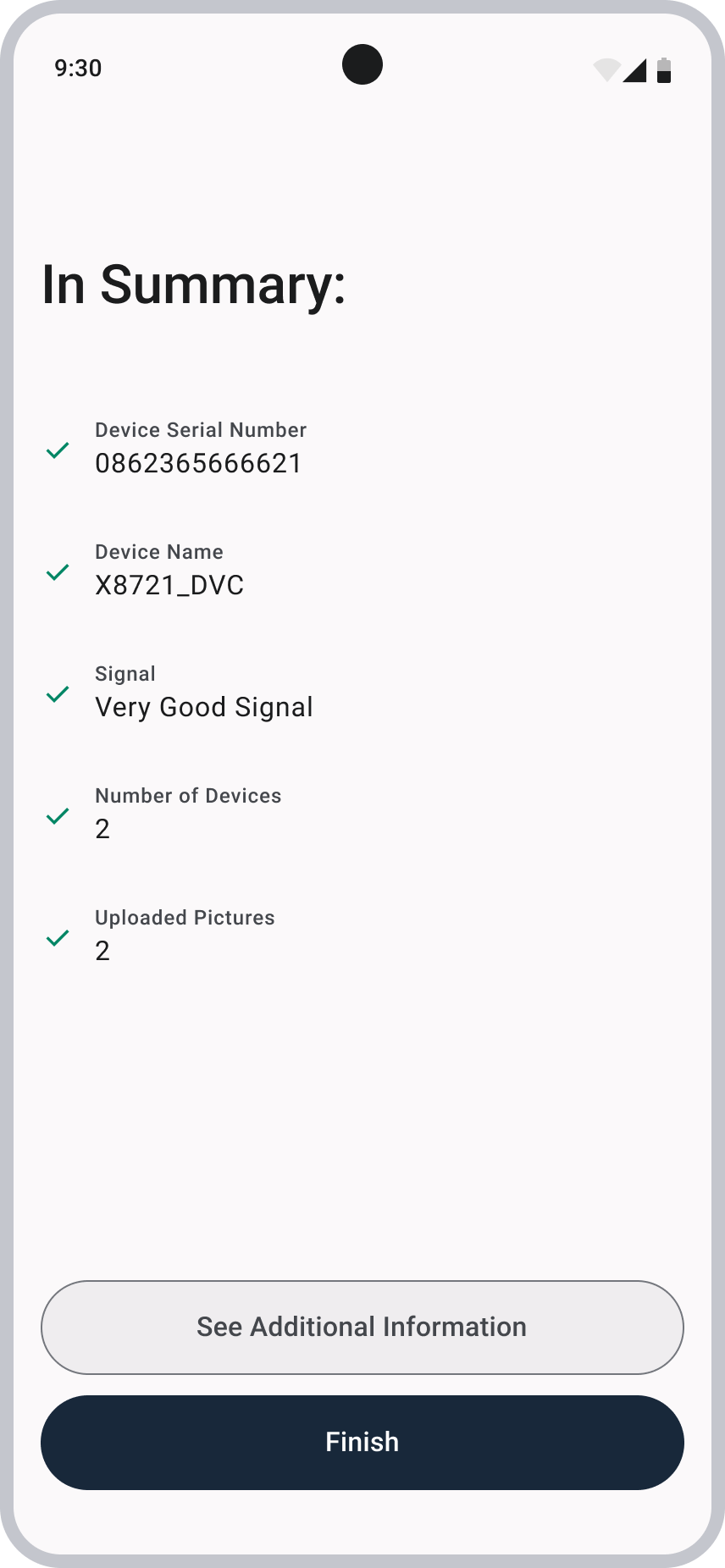
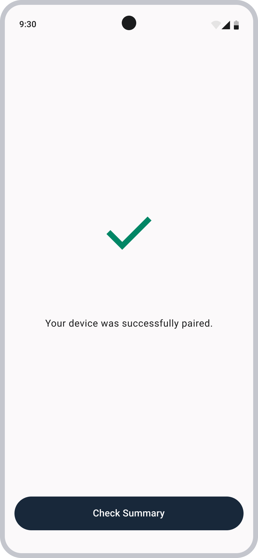
I slightly redesigned the “Details” screen, which prepares users for the process they are about to begin and highlights the key requirements they need to consider. I also introduced a new “Summary” screen that appears once the device is commissioned, presenting all relevant information about the device in a clear and organized way. Finally, the end-of-process screen was redesigned to be simple and explicit about the outcome, clearly indicating whether the process was successful or if it failed.
Homepage
Details
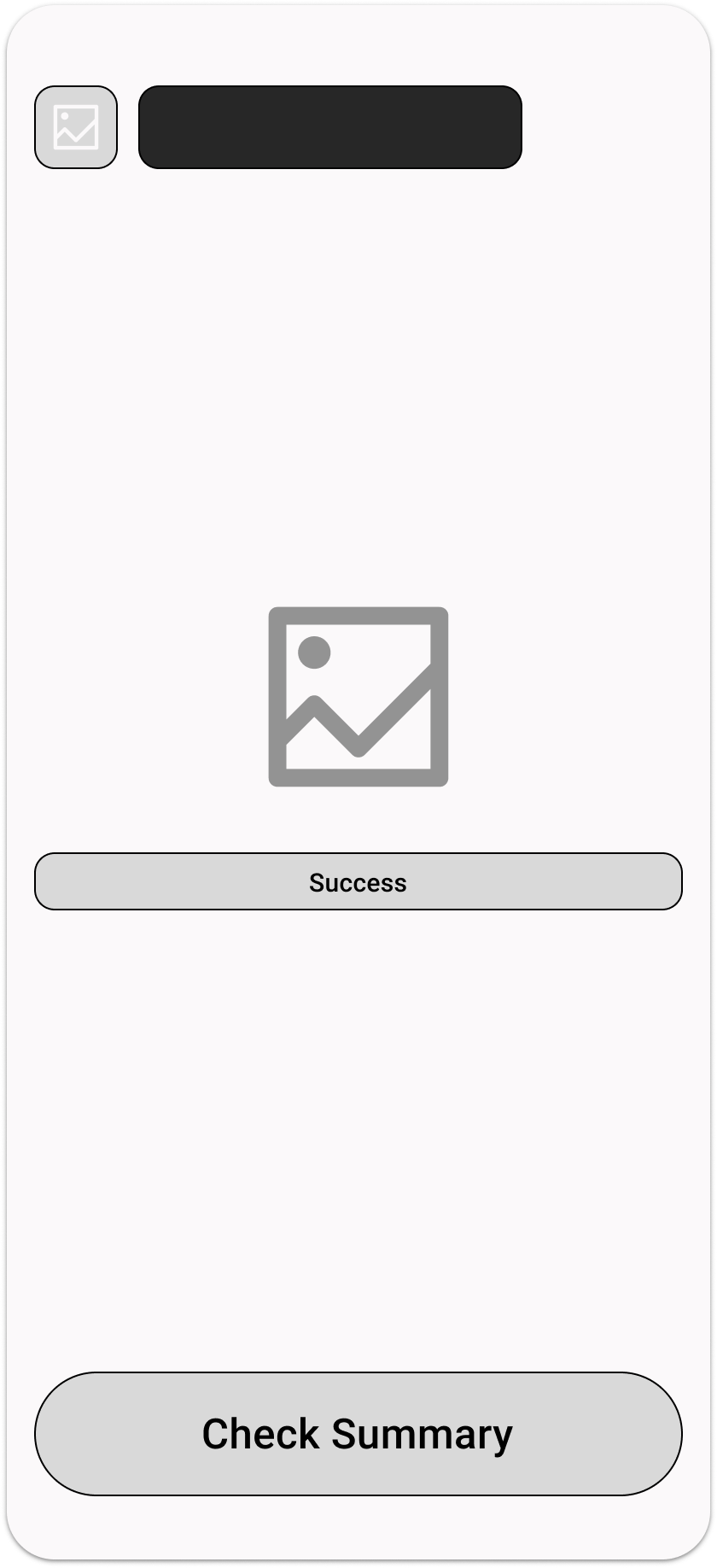
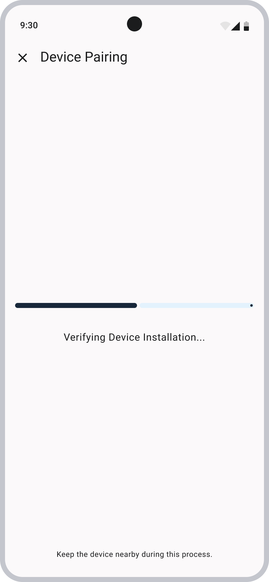
End of Process
Summary
FINAL ITERATIONS AND THOUGHTS
High-Fidelity Wireframes
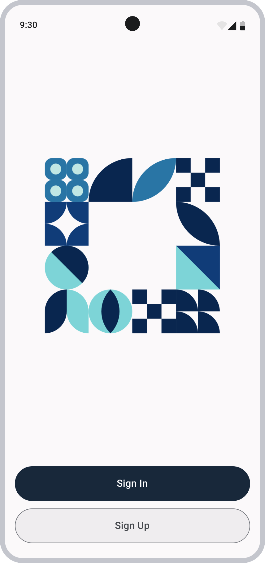
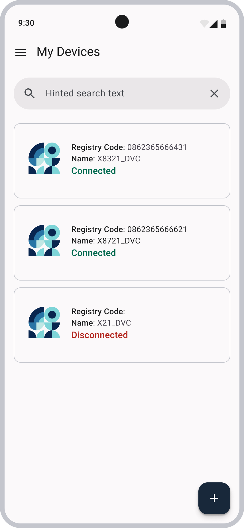
After reviewing both the mid‑fidelity wireframes and the existing app screens, I moved on to designing the high‑fidelity wireframes. Reminder that every screen had to be masked due to confidentiality reasons.
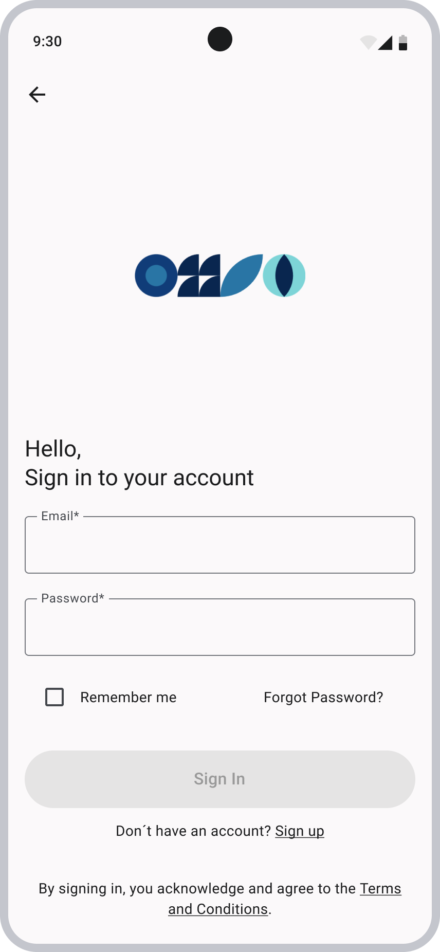
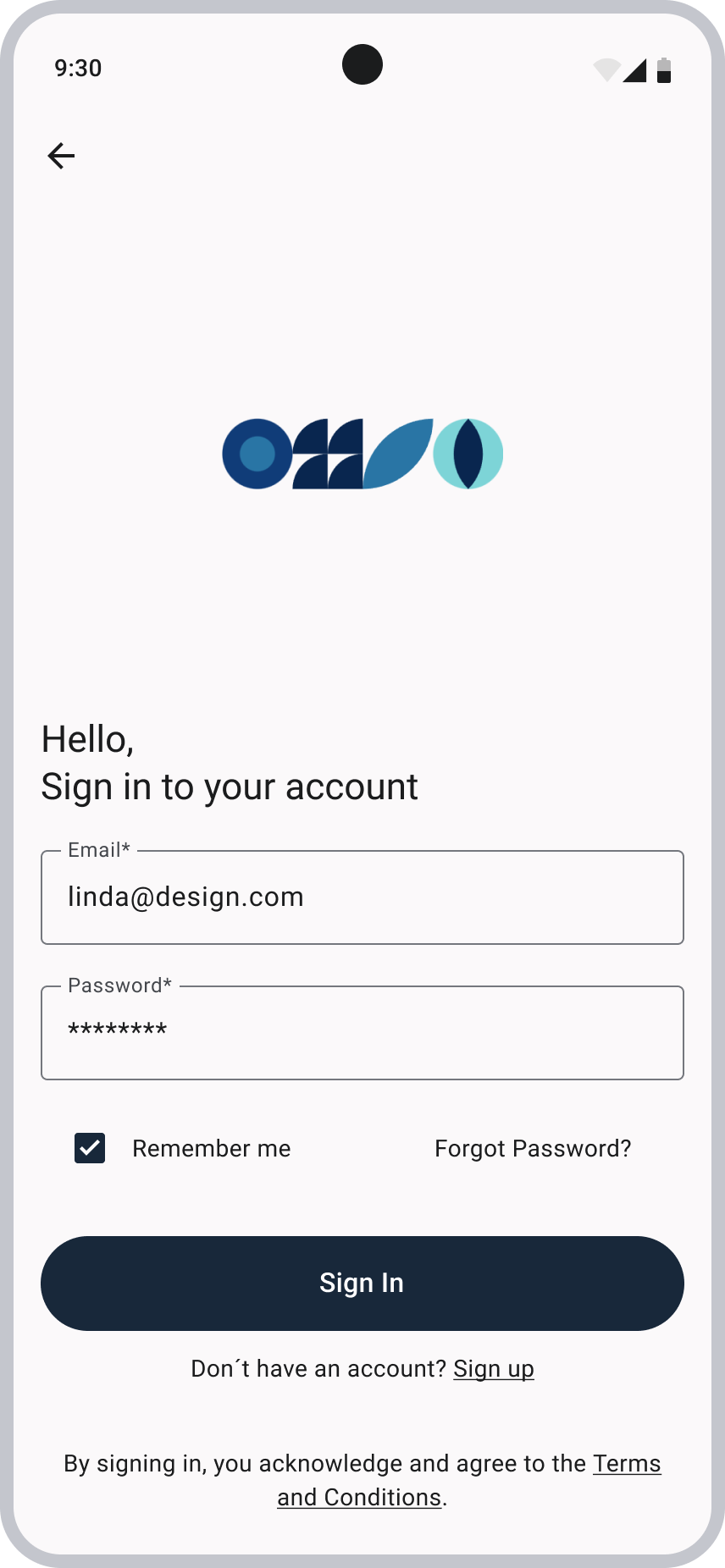
Sign In
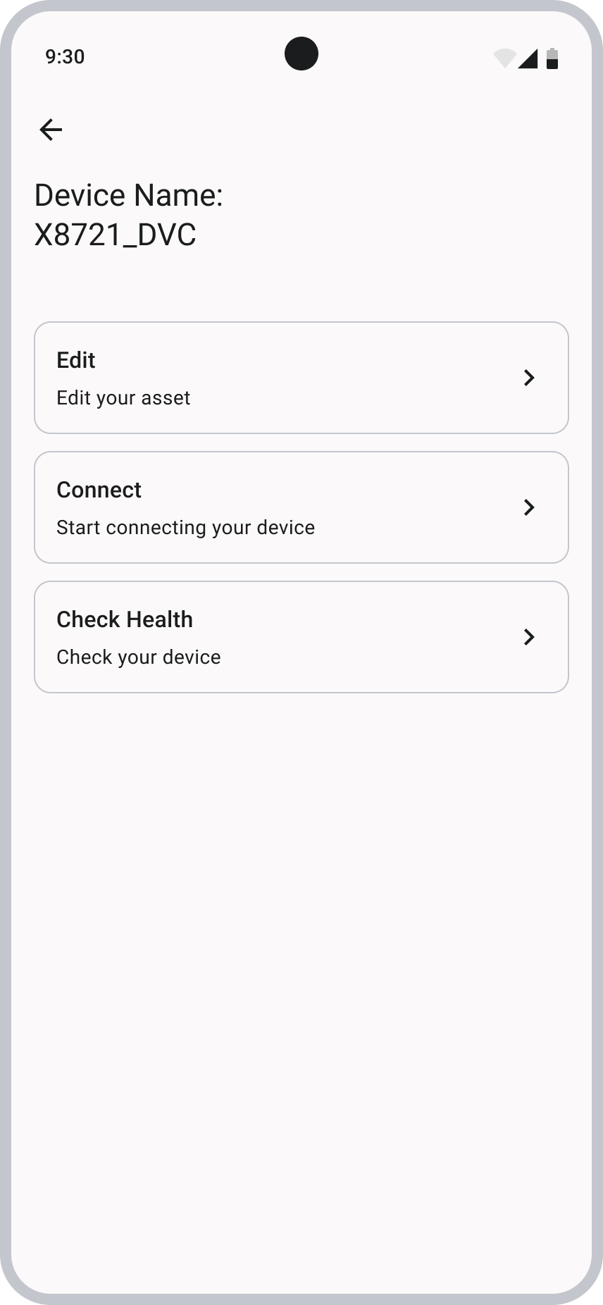
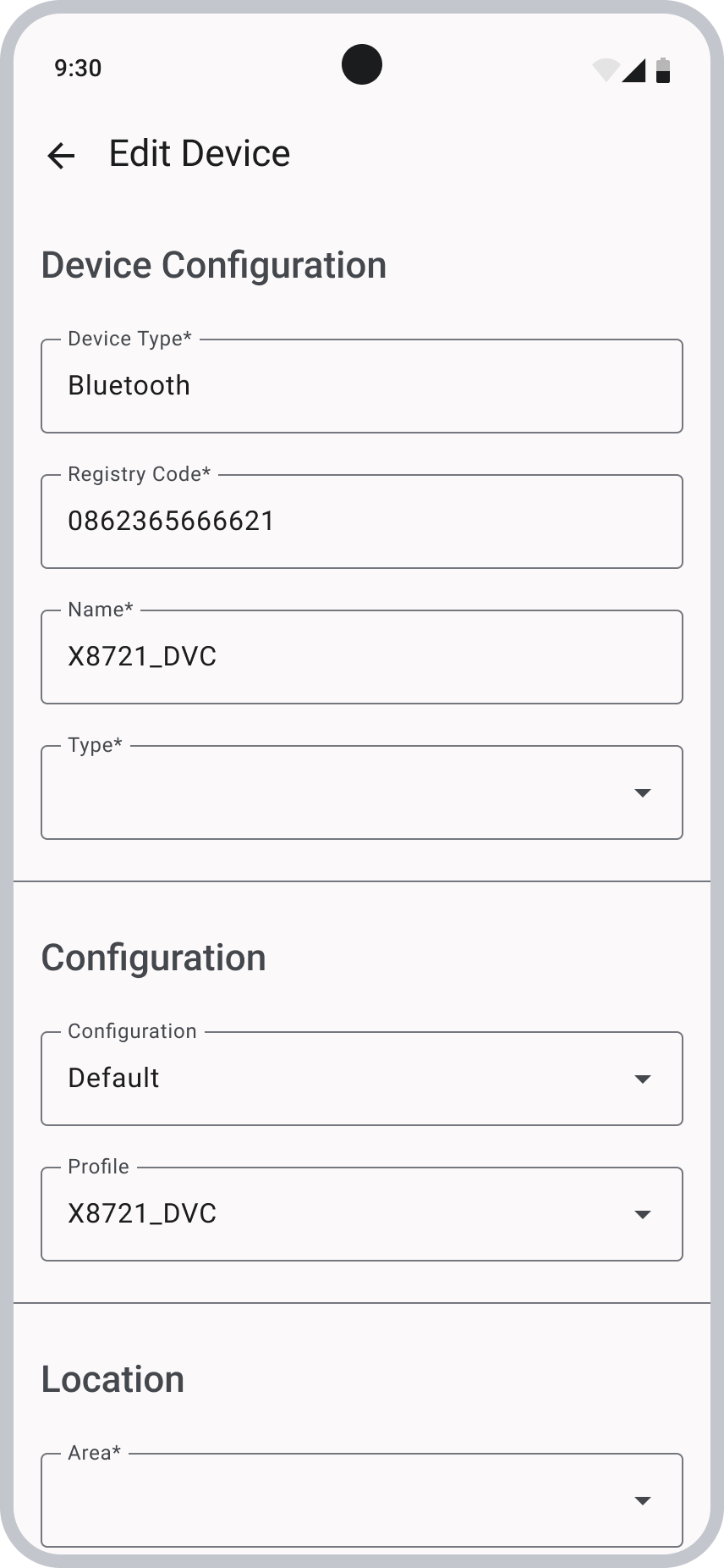
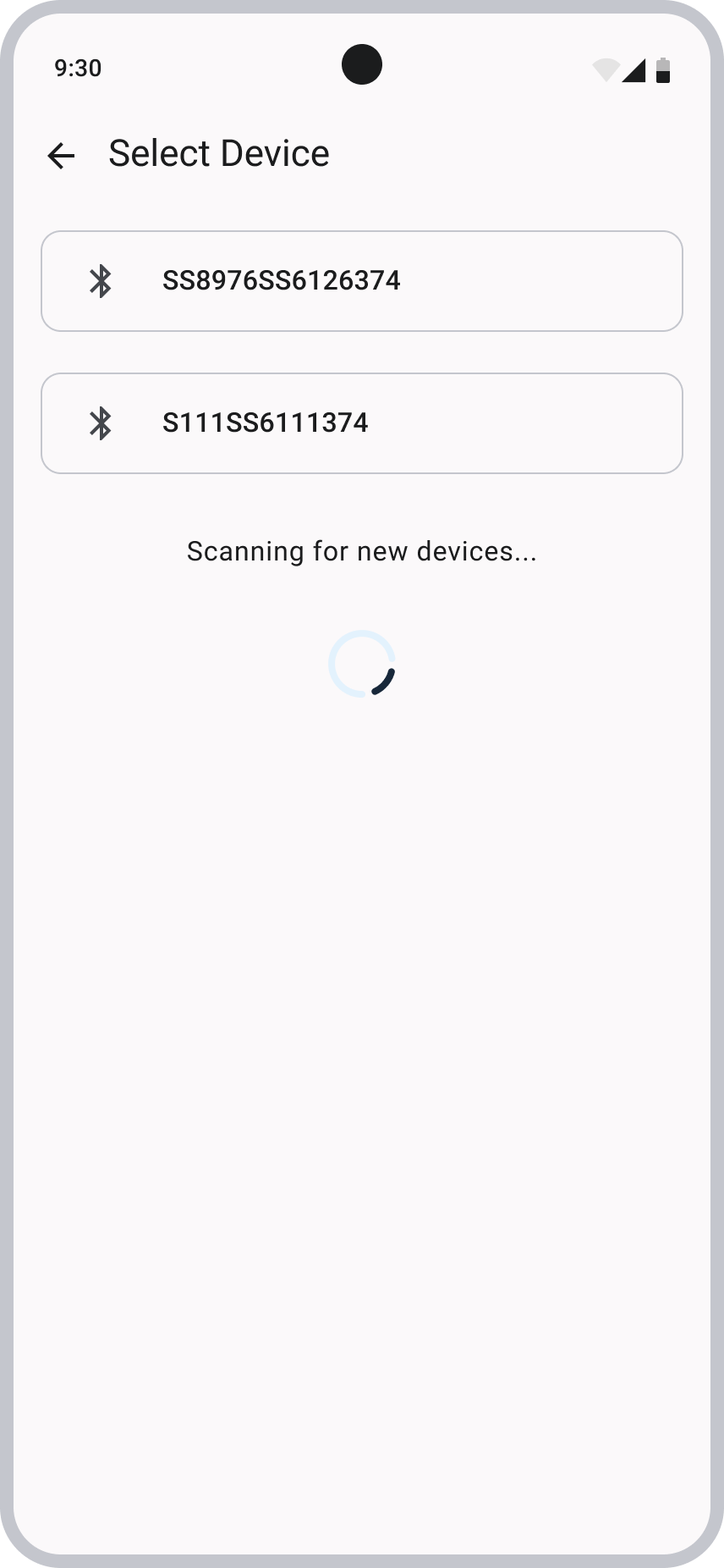
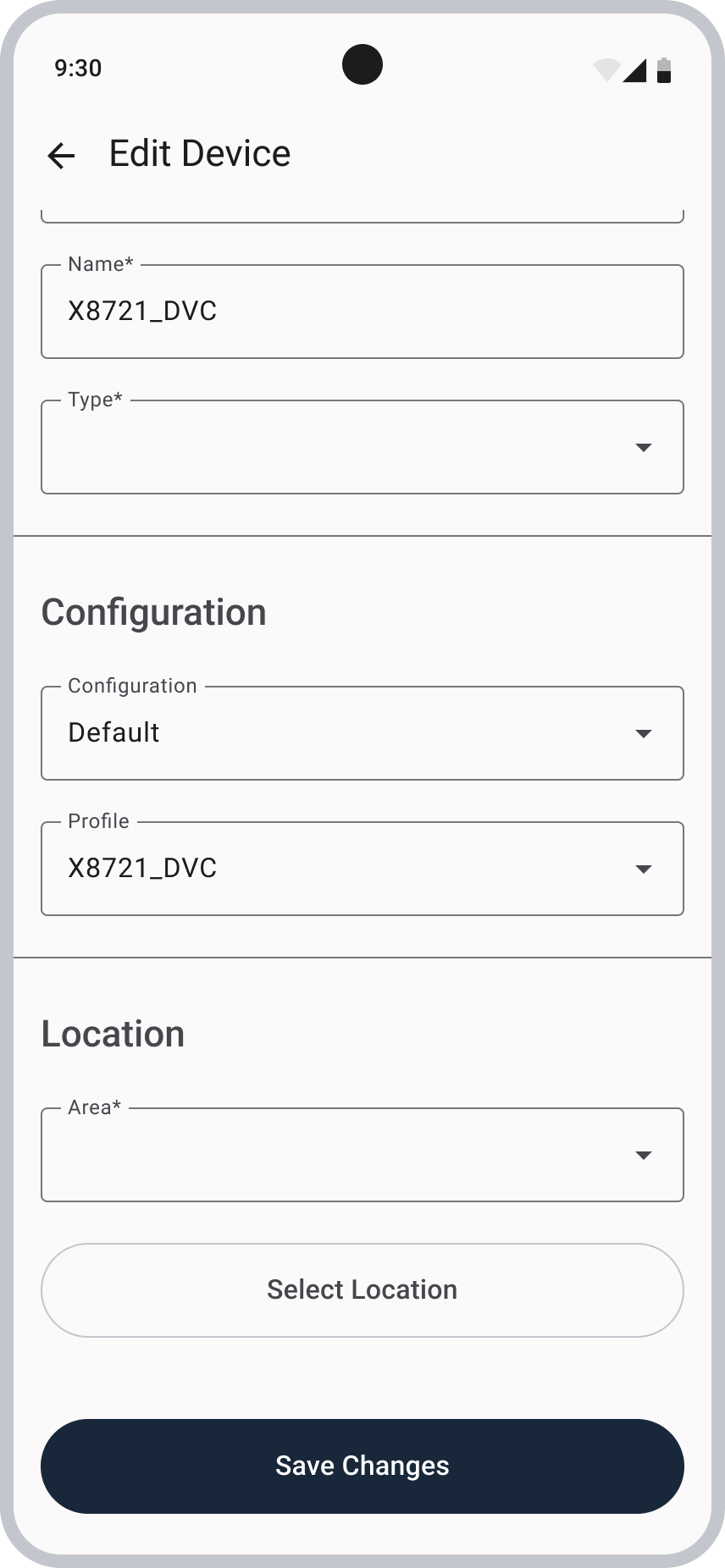
Main Menu and Edit Device
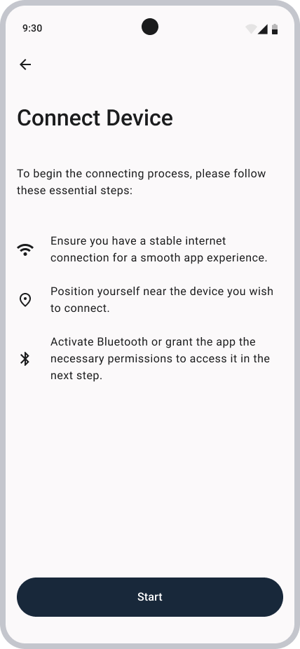
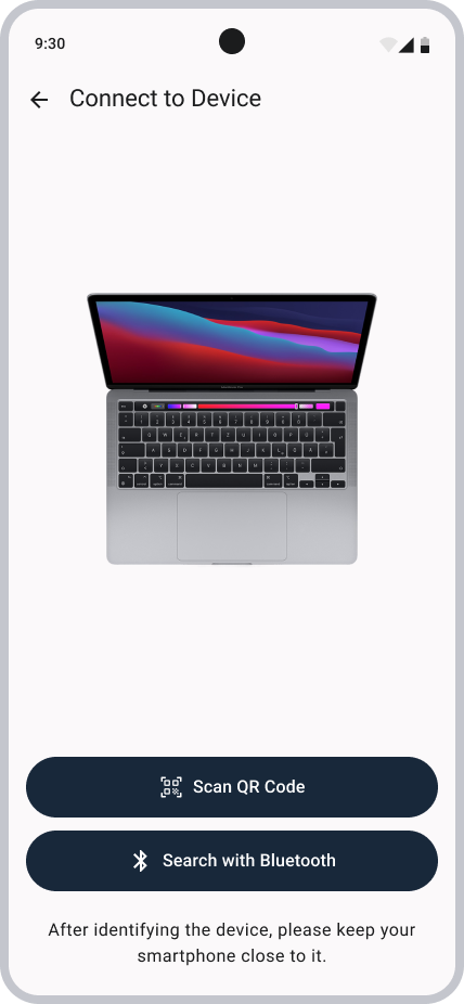
Connect Device
Reflections
After reviewing both the mid‑fidelity wireframes and the existing app screens, I moved on to designing the high‑fidelity wireframes. Reminder that every screen had to be masked due to confidentiality reasons.